Florence, AL (AP) – Some residents think a northern Alabama city’s new logo might be sending the wrong message.
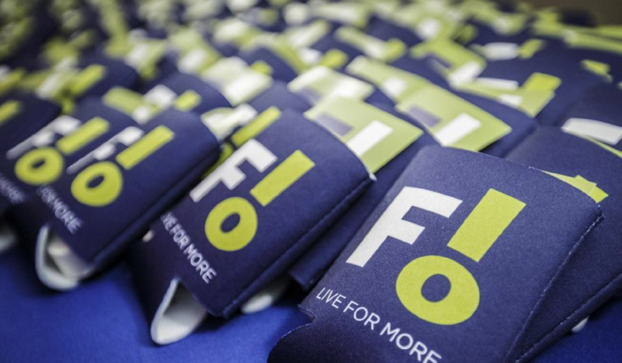
Florence’s new logo uses the first three letters of its name, a capital F followed by an L and an O arranged as an exclamation point, to form F!
When the city unveiled the new logo this week, it drew immediate backlash and an online petition demanding changes that had nearly 7,500 signatures. The city paid $25,000 to a Birmingham marketing firm for the branding, WAAY-TV reported.
“The new logo symbolizes the people of Florence’s passion and love for the city,” the city said in a news release announcing the new logo. “A sense of amazement, delight and pride is all reflected in the Florence logo exclamation point.”
City leaders are pushing back on claims that they didn’t consider hiring a local firm to do the work, saying a request for proposals was issued but no local companies responded.
Residents were engaged early in the process through a community survey sent to hundreds of people, city officials said. WAAY-TV reports that it was unable to find a copy of the survey and the city didn’t respond to its requests to see it.
In a letter to residents Thursday, Florence Mayor Andy Betterton said the new branding “will serve multiple needs and audiences as our community grows and moves forward.”
“As we navigate developing the new branding, one thing is for sure; the process has highlighted our community’s talents, humor, and love for Florence,” Betterton wrote.
City Council member Kaytrina Simmons said she has requested a meeting with the mayor and council to discuss the logo and revise it. In a letter to residents, Simmons apologized for the logo which “has brought so much disappointment to our great city.”


